“I hate this. The art is too lumpy.”
Is what my friend said when I sent him one of my favorite early works of Rebecca Sugar, the animator most prominently known for storyboarding Adventure Time and creating Steven Universe. I blinked at my computer screen and leaned closer, trying to fit the words “hate” and “lumpy” together like two mismatched puzzle pieces. I didn’t know how to respond—I loved these characters.
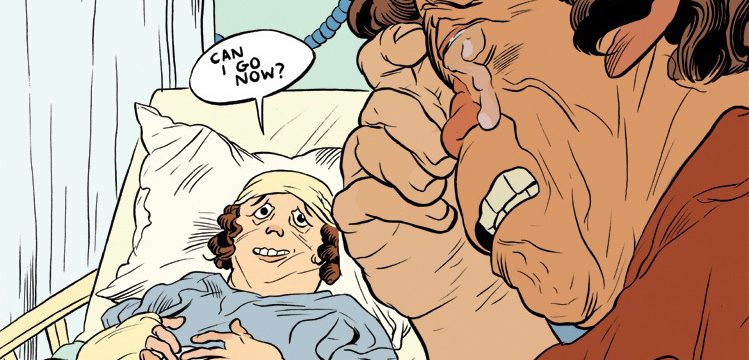
I looked back at the comments on the wordpress site that archived Don’t Cry For Me I’m Already Dead, Sugar’s famous tearjerker comic on friendship, grief, and The Simpsons. Most praised Sugar’s careful and compassionate approach to such an emotional story, but her criticism was fueled by her squishy, saggy, exaggerated objects and bodies. Which I love! It’s no secret that Sugar draws with a “fondness for squishy movement and distressed faces”, particularly when illustrating intense or poignant scenes, and although Steven Universe has stuck to a pretty simple style when compared to Sugar’s personal works, many of the key scenes she illustrates still reveal this iconic style.
I’ve always felt that this aesthetic was one of the attributes of Sugar’s work that made it most interesting, and I’m endlessly saddened and frustrated by readers who can’t “connect” with Sugar’s story because of her artistic style, especially because this is one of the strongest ways in which I personally connect with her art. I can’t convince these readers to like her style, but I can try to build some appreciation for it by covering the possible origins of her style, how and where it is used, and its significance in her work.
Where did it come from?
There are some bread crumbs of Sugar’s early art scattered around the internet, although she’s deleted most of it in what seems like an attempt to erase her old web identity: her old website can’t even be accessed in the Wayback Machine. Fortunately, we still have several recent interviews with her thanks to Steven Universe, and pages on her very old DeviantArt account, which has also been cleared of art but can still be tossed in the Wayback Machine to reveal some of its secrets. In what remains, we can see the origins of her art style and themes (and a Stephen Colbert painting). In 2006, you can see a thumbnail of her single page comic Chubby Mary in Space; a Google search can lead you to this preserved copy. Using Archive.org here admittedly feels a little invasive, and maybe she’s a little embarrassed by her old art, but it’s all incredibly valuable in evaluating changes in her aesthetic over time.

Mary’s body is, compared to most of Sugar’s “chubby” characters, not very exaggerated, but this comic is still reminiscent of her recent works. It, along with her comic Pug Davis, takes place in space, demonstrates the “unreal” and hallucinogenic quality that she loves, and has a provocative, lonely tone. In her journal on the old account, she also mentions a lost comic series named Margo and Dread, and has posted sketches of the unfinfished issue Margo in Bed on her active Tumblr. These comics don’t take place in space, but exhibit the dark and goofy tone of Pug Davis and Sugar’s extremely exaggerated, fluid, saggy movements. These are all great samples of her art, but they only provide a timeline of evidence of her art style changing.
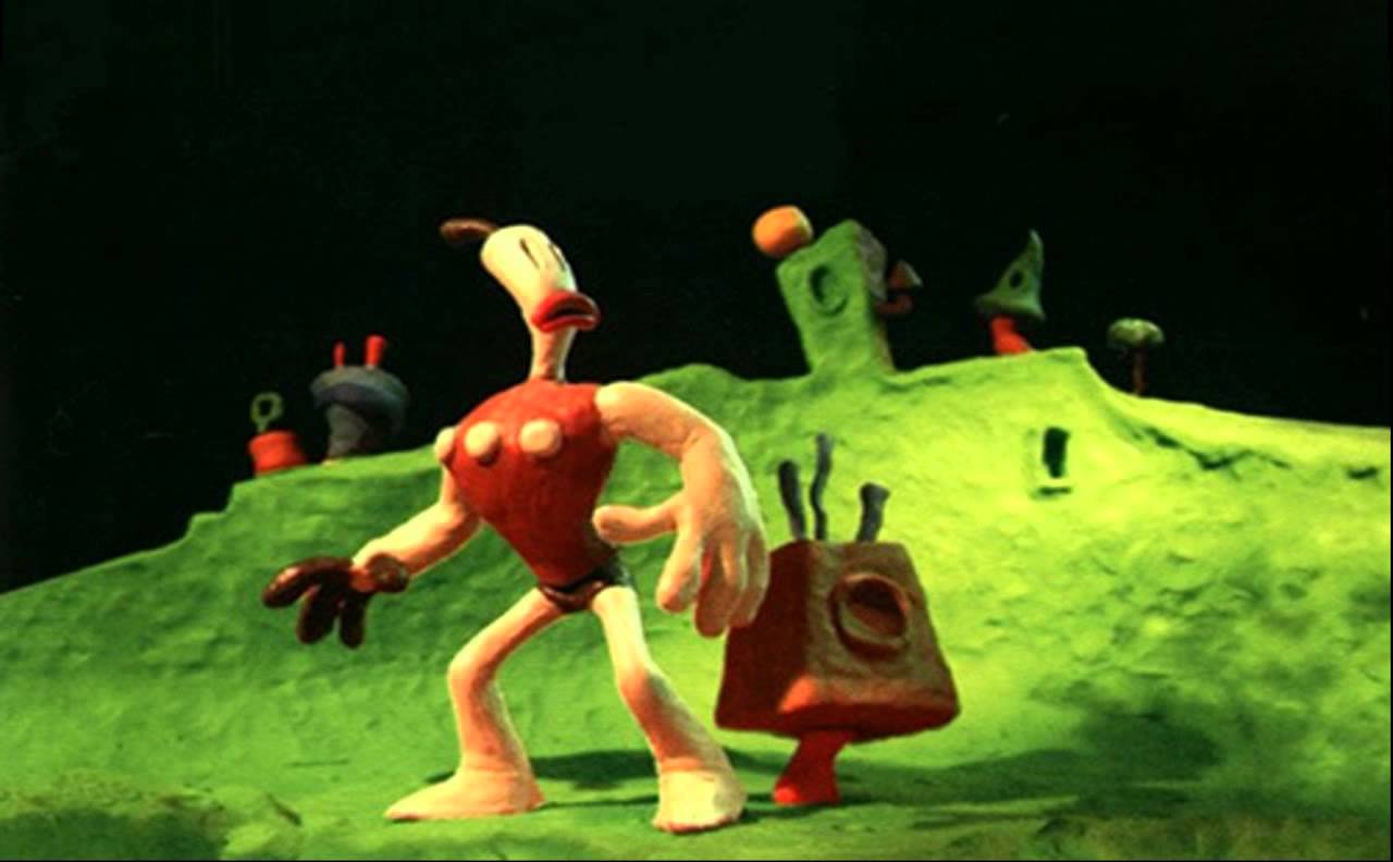
Then what are her influences? A great clue can be found without even using the Wayback Machine: on her DeviantArt, one of the few facts listed is that her favorite character is Eddy, the clumsy and conniving ringleader from Ed, Edd n Eddy, which ran from 1999 to 2008. The style of this show could also be considered “ugly” in that many of the motions have an ungraceful fluidity and extreme exaggeration, and Rebecca Sugar drew a lot of “fan art” of the show as a young artist. Second, in an interview with Gizmodo, Sugar notes that the claymation video games The Neverhood and Skullmonkeys had a strong influence in her worldbuilding. The main character in her short film Singles (2009) and the titular character of Pug Davis both have a remarkably similar design and “texture” to the player character of The Neverhood, and the clay-like lumpiness of her characters’ bodies could very likely be influenced by these claymation works. Lastly, it’s a known fact among fans of the show that Steven Universe references a lot of anime thanks to the many anime fans working on the show, namely Rebecca, who frequently takes elements from the pseudo-surrealist anime Revolutionary Girl Utena, which aired from 1996 to 1997.
Based on these influences and the style changes exhibited in her artwork timeline, I hypothesize that early claymation is a strong influence for this “lumpy” style in her artwork, and the neurotic and wild animation style of Ed, Edd n Eddy contributed to the intense motions in her comics like Margo in Bed. Fuse this western-driven aesthetic with the subjects and tone of popular 1990s anime, and we get the richness of Rebecca Sugar’s narratives.
When and how is it used?
I’ve found very little critique and analysis of Sugar’s aesthetic choices, aside from appreciation of it, so I’d like to try and do that here. To see when she draws her characters like they’re melting clay, we can compare the tones and styles of many of the comics collected here against Pug Davis: the biggest surviving sample of her comic work. Very quickly, we see that this style is predominantly used when characters are distressed, neurotic, disturbed, or struck by any kind of intense, (usually) negative emotion, and characters in works like Don’t Cry For Me I’m Already Dead and Singles are almost exclusively “lumpy” because this tone is sustained throughout the story. Sugar even notes in an interview that she found her love of illustrating “neurotic-like characters” through their frequent appearances in her comics; it’s no wonder that these distressed and squishy characters exhibit her artistic style so well.
In Pug Davis, it’s difficult to identify this style on Pug’s face because he literally has a pug face, which naturally looks wrinkly and cartoony. However, in the first chapter, Pug and his sidekick Blouse both experience several intense flashbacks, culminating in this heart-to-heart between the two in which Blouse makes this horrified, melty face, and his hands seem to go weak as he touches his unburnt face.

Although Blouse is one of Sugar’s thinner characters, he still begins to look clay-like and fake when Sugar draws his horrified close-up, not unlike Will Eisner’s exaggerated realism on close-ups of intense characters, like the desperate and depressed Frimme Hersh.

This brings us back to Don’t Cry For Me I’m Already Dead. On the Rebecca Sugar Exaggerated Body Scale, this comic is a 10, which has also made it a concentrated target for criticism of her style. Despite being one of the only comics she has made that doesn’t involve or take place in space, it’s also one of her most surprisingly surreal comics, topped only by Singles (in which the character leaps out of the hole in his own stomach and into the void, which is pretty hard to beat). The despair and denial of grief over his brother Alan causes Jim to “revive” his brother by remembering the Simpsons quotes they would recite to each other, painting a dream-like, uncanny scene that’s incredibly familiar to anyone who has experienced the loss of a loved one. She achieves this surreal level of grief by exaggerating sadness on the clay-like bodies of her characters until they literally look like they’re falling apart in grief.
There is something much more real about the characters when they’re drawn this way. Their ugliness, even in neutral panels, has a human quality that could not be achieved if they were beautifully, elegantly drawn. Grief is a surreal and uncanny experience—it’s shocking and nightmarish when someone is suddenly and unexpectedly torn out of your life—and Sugar’s unreal style compliments this level of grief. Similarly, when this same style is employed in Singles, as the character drifts into the void and seems to desperately question their existence, Sugar evokes a sore loneliness and ugly anxiety buried deep in this character and in her viewers. It’s not a romanticizing of these emotions: it’s real, it’s heartbreaking, and it’s ugly.
In conclusion, I don’t just think that Rebecca Sugar’s “lumpy” art is cool: it’s an essential component of her narratives. Her emotional exaggerations both capture the realness of human bodies and human feelings, and the unrealness that we feel as we experience them.
[vimeo 9115247 w=640 h=360]
Singles from Rebecca Sugar on Vimeo.
I feel like you missed a great opportunity to make an LSP joke, so I’m just going to leave this here:
https://www.youtube.com/watch?v=u1nTTDZSz4s
This is a great analysis of Rebecca’s style, but you didn’t mention the John K. influence. She used to be really into Ren and Stimpy.
I completely forgot, thanks for mentioning that! The animation of Ren and Stimpy is especially similar to the style in her solo projects.