So I’ve read more classic literature graphic novels adaptations than I have any other type of comic. Most recently, it was Gris Grimley’s Frankenstein.


As a fan of the original novel and its interpretations (I watch National Theatre Lives’ Frankenstein every year for Halloween which I highly recommend), I was really excited to read this. I was expecting an interpretation of the original text applied to a graphic novel. What I got, however, was Shelley’s text over steampunk versions of the characters that just did not pair well. The novel starts off when four letters like the original, but they are “handwritten” which makes them impossible to read. I tried to read the first few paragraphs and immediately skipped over them. If I had not read the original it would have made the beginning of the adaptation very difficult.
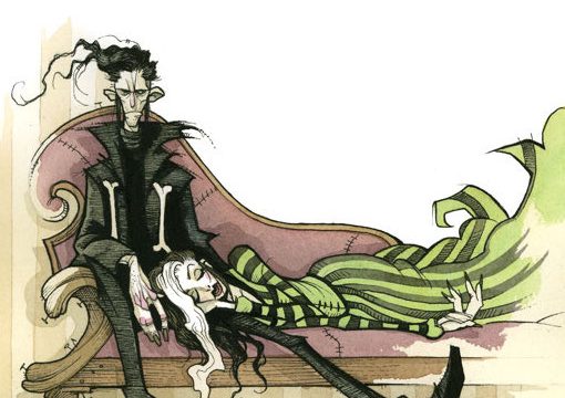
The illustrations by themselves, however, are fantastic. If this entire novel were an adaptation it would have been fantastic. I mean Elizabeth totally rocks a Mohawk. The amount of expression that each character has (except when they go cartoony for a tone shift) is amazing to analyze. The illustrations often work together with the background behind the panels themselves.
 I love the way the black background seems to drip down into Frankenstein’s hair and provides an emptiness for the creations bones as well. This is common for a lot of the pages where characters are feeling extreme emotions. They are very successful in getting those emotions across and keeping the reader on the page longer to focus on the detail.
 One thing I love about Frankenstein is that while the creation of this creature is fantastical, the story is not. I felt that the illustrations took away from the punch of the story; it felt less real and more of a beginner’s guide. The illustration of William, for example, looks like a doll. This provides a nice contrast between the creation and William but taking their interaction seriously with the text was difficult for me. The novel itself is known for being dense. A graphic novel version sounds like a fantastic idea. But because the text was not updated it just didn’t flow with the illustrations for me.
In the second to last panel, that boy looks ecstatic about the fact that he’s being strangled to death. It’s such a weird take on the text and I have really mixed feelings about it. I go back and forth from finding that scene hilarious to feeling bad about laughing about a child’s death.
Hopefully, that isn’t just me.