I recently had the great pleasure of reading the Watchmen series for the first time. I cracked it open and got maybe ten pages in before I realized I wasn’t reading it as fluidly as I would’ve liked to. My obstacle? Bold words, in almost every speech bubble on almost every page. Eventually I got used to this regular usage of bolding. But…why’s it so prominent?
I find I didn’t have this question before picking up Watchmen. Though, I’m really not much of a comic book reader. There were those two manga phases before high school where I read collections like Fruits Basket and Rave Master. I can remember some copies of Fashion Kitty and Babymouse from elementary school. I’ve read some works of Will Eisner’s and one Donald Duck issue for class. But I didn’t find my attention quite so overwhelmed by bold lettering in anything I’ve previously encountered.
Not to say that the other comics I’ve seen didn’t bold their words, or that Watchmen is the only one where it appears so consistently. Just unlike anything that makes remote sense, I’m generally inclined to pay more attention to the details of the text over the details of the images when reading comics.
Devices like bolding, italicizing, and capitalizing are used in writing to mimic our natural intonation in speech, or tell us where we should put stress in our intonation to enhance the meaning or re-direct our focus to main ideas. See? I wrote should in italics, which should make you read should with more emphasis than the other words in the sentence.
Let’s take a look at the title of this post. Perhaps you read it with emphasis on “bold”, as intended. But maybe you also read it with emphasis on “this”. Now, did the fact that I didn’t make “this” stand out inhibit your inclination to emphasize it? Think about the way you automatically read it in your head:
- Well this was a bold choice. This particular thing, as opposed to others, happened to be a pretty significant one.
- Well this was a bold choice. “This”, something that was pre-established, wasn’t a simple choice or a shy one, but one that was pretty out there. Kind of read the way you’d say it if you weren’t trying to say the choice was bad. Like, “well….it was a bold choice…”
You were probably more drawn to the first iteration, with slight emphasis on “this”. Consider if I’d just written “Well this was a bold choice…” with no outstanding capitalization at all. Did anything change for you? Probably not. It’s all because your brain already knows where stress should appear naturally. With this kind of example, you don’t necessarily need to be told where it goes.
The way words are written in comics is done by a letterer. I guess that leads me to question David Gibbons, the letterer for the Watchmen series. A look at other comics he’s worked on shows variation in the amounts of bolding. In “Green Lantern – The ’80s #1”, he utilizes a lot of bolding too. But in works like “The Originals” and “Strange Adventures #1”, we see very little.
Italicization in comics isn’t so easy to differentiate from regular text, but it’s still used in some comics for specific nouns like titles and names. Capitalization is incredibly prominent in basically every comic font, so it’s not really used as a tool of emphasis because uppercase text is preferred exclusively. Bolding is what’s mostly used to create stress on words because of it’s noticeability.
From what I’ve gathered, it seems to be used more frequently in hero-related comics and can come off as disruptive to sensitive readers that receive it as too much emphasis.
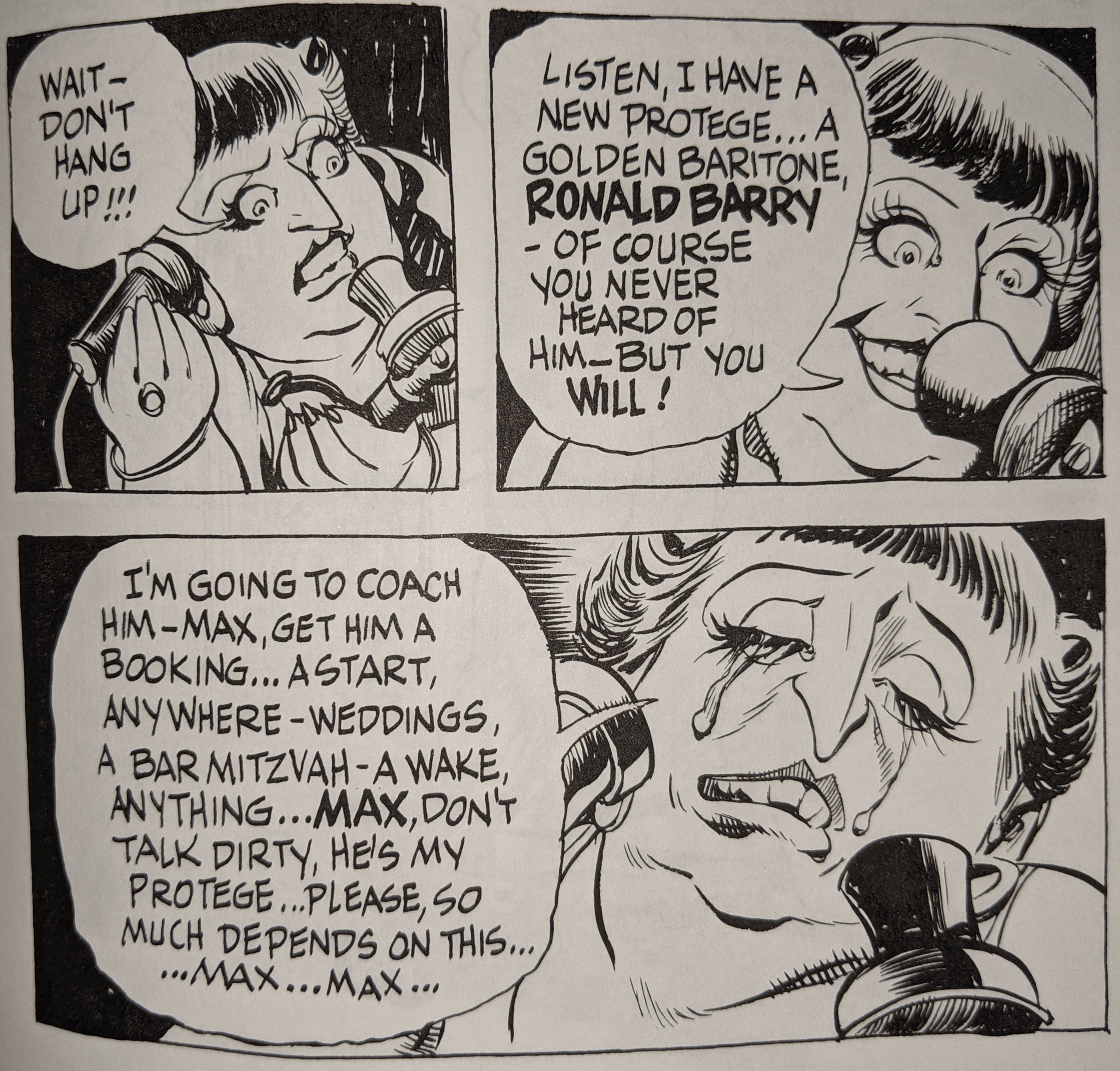
It can be used to specify one choice out of many options, like “him”, as opposed to someone else. Here’s an example from Walt Disney’s “Donald Duck in Vacation Time.”


It’s often used to highlight names of people, like here in “The Street Singer” by Will Eisner,
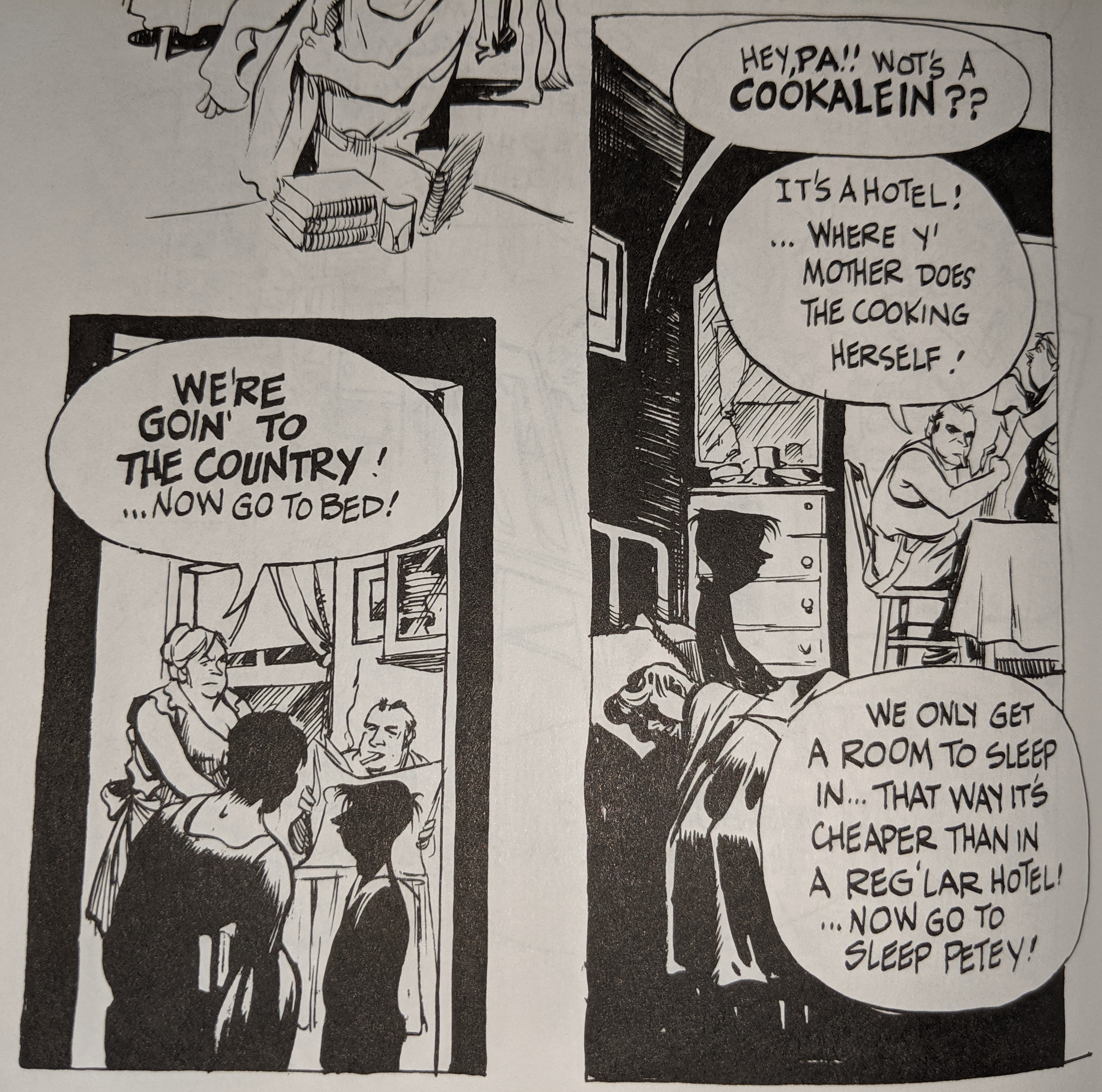
or it can be found paired with large text size to double the stress on something said loudly maybe, like in Eisner’s “Cookalein.”
Then, there’s Watchmen.

For someone like me, a great chunk of the bolding in these three panels seems…redundant. As in, it’d still be understood the same way without words like EDDIE or TOP or MAINE jutting out against the rest of it.
It’s nit-picky, yes. Extremely so. Who’s paying that much attention, at the end of the day? We read comics so quickly because it’s the graphics that matter most. But the way in which text appears in any format matters a great deal too. It’s a culmination of what font is used, how much space appears between letters, even where “I”s with crossbars are appropriate to use (check out all sorts of lettering details you didn’t know about). It’s about which words are made bigger, bolder, and intended to stand out. It’s about how you read it versus how they want you to read it, and if they’ve succeeded, both should match up. Everything’s a strategy to guide the way you read. Some stylistic devices just appeal to some more than others.
How do you feel about bold text in comics? Do you even notice it?
[featured image from a 1966 Justice League of America comic]
I feel like I can go in and out of phase with noticing the bolding in Watchmen or ignoring it. Like, when someone points out how frequent it is, like you’re doing here, I definitely can’t not see it for a while, but then that attention gradually fades. I think I actually tune it out to the point of not even noticing how it implies intonation. I think it’s not just how frequent it is, but also how different the bold lettering is from the regular lettering.
Typography and lettering in comics is a fascinating topic, so thanks for sharing this thoughtful exploration!